After 20 years in business, barbers Korner Kutz had a great reputation for cutting hair but were struggling to attract discerning younger clients.
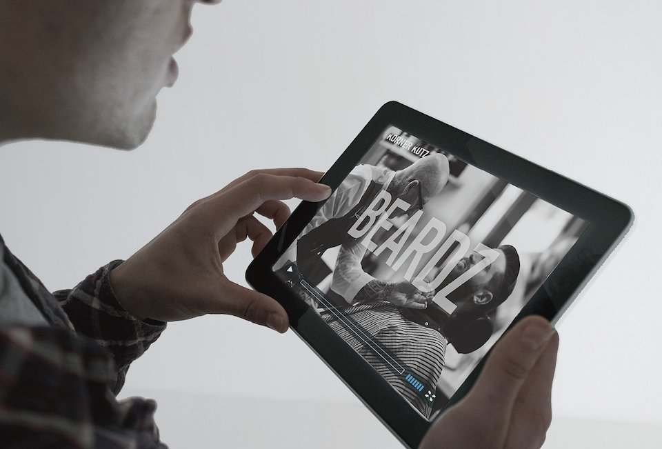
The idea was to bring them up-to-date with a new identity that would leverage their quirky name and authentic barbers' credentials.
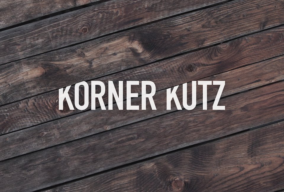
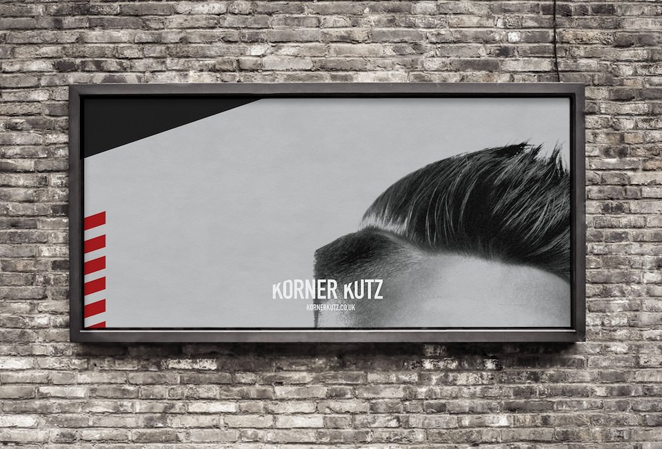
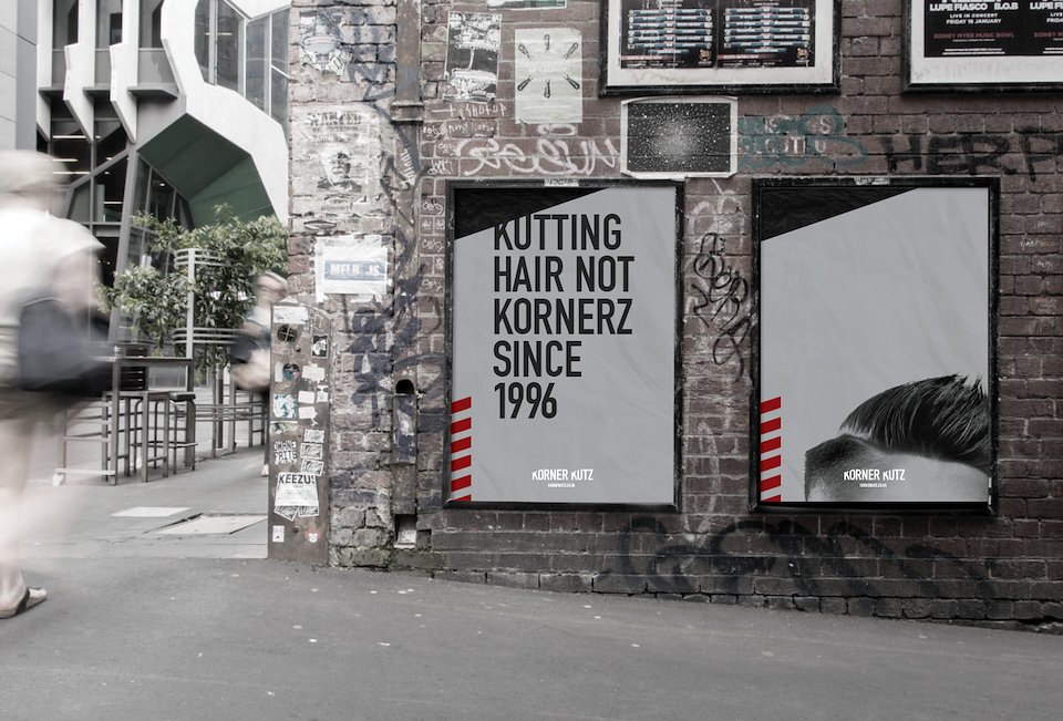
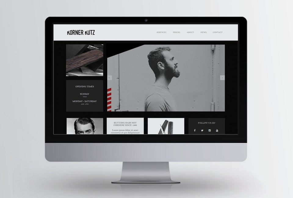
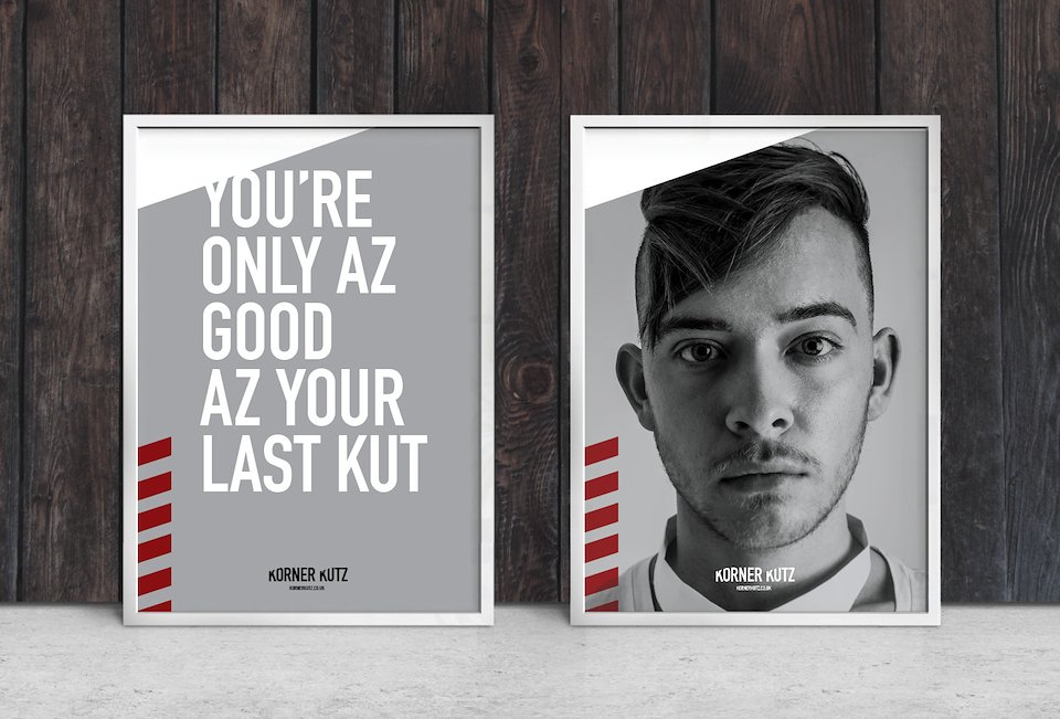
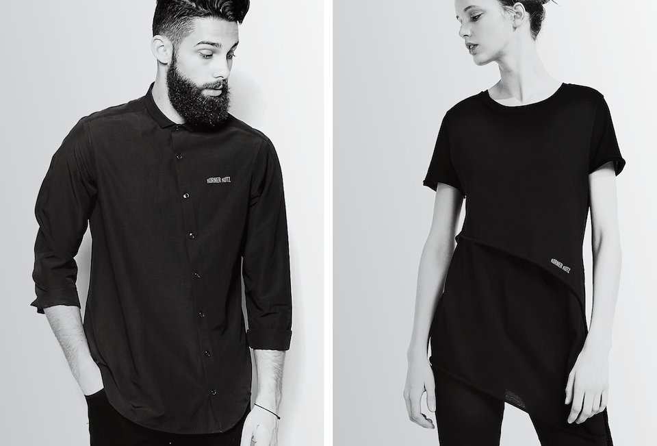
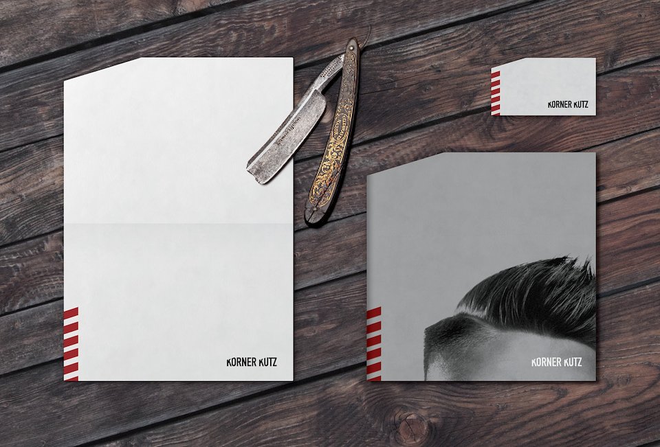
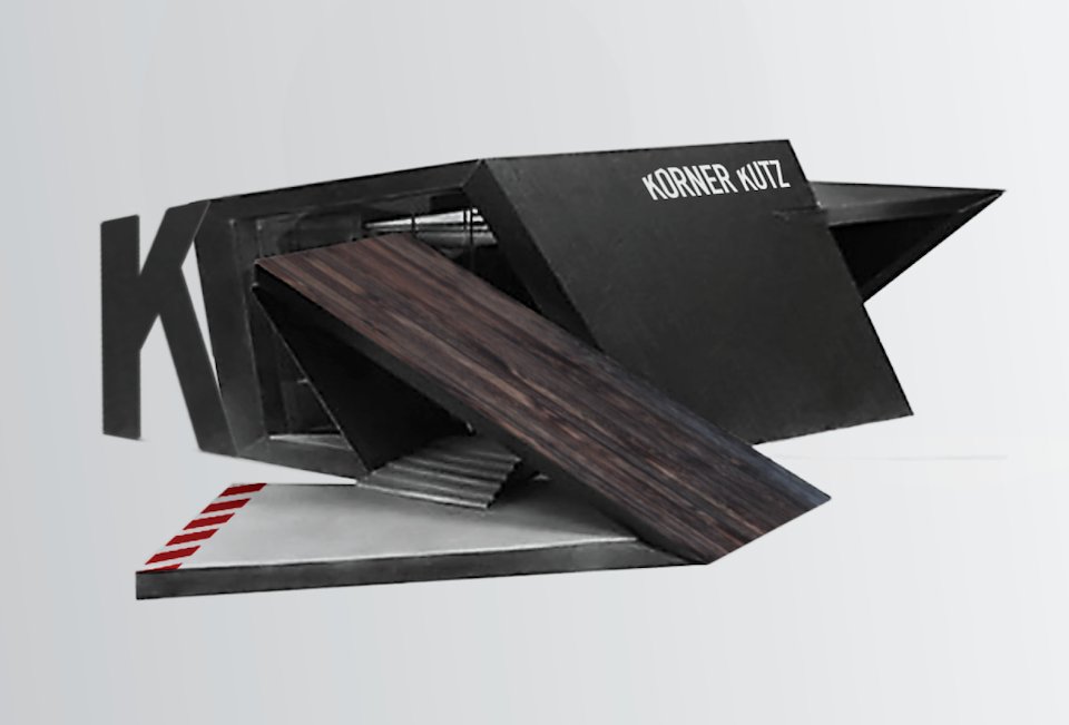
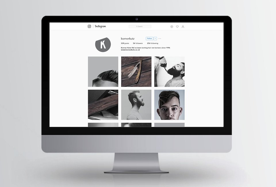
The logo and associated design work play on the simple visual device of a cut corner. This is supported by a graphic nod to the classic red & white barbers pole and simple black and white photography. Copy is given a unique twist in line with the company’s name.
There was even the chance to indulge my inner architect with a concept shop design.